
THE HISTORY OF THE BRAND
PART 1 - 9/27/22The Chad-tees inc. brand has not always been what it is now. When we started in 2019, there was no direction or plan in mind that would have lead us to where we are now.
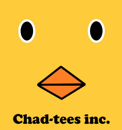
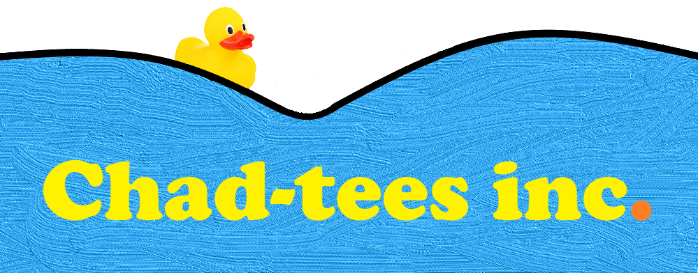
It started as an idea we could not really piece together. We started by putting some shapes and colors together. Yellow and orange felt right at the time, and we found a stock image of a rubber duck that we used as inspiration. The only shapes we really knew how to work with were some triangles, squares, and circles.
We were not going to stick to just ducks, that would have been really odd. However, that would have been our main focus because that was really all we knew how to make.
Later in the same week, sometime late March, my sister, Evelyn (11 at the time) came up with "Chadteez". While it did not stick with me at first, we both agreed it was much better than the duck nonsense and gave the concept a good direction to move forward with. We agreed "Chad" and "teez" needed to be seperated as it looked too much like the word "Cheez". So we switched the name to "Chad-tees inc. " and in that redesign alone, we had already improved our duck drawing skills.
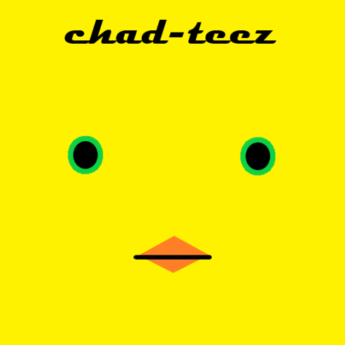
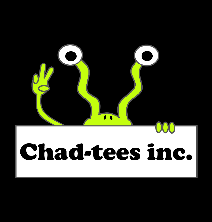
It was then time to seperate "Chad-tees inc." from its duck counterpart, so we removed the yellow and the creepy eyes, leaving just the brand name. We quickly realized how much stronger of a logo that was by itself than with the duck, putting the duck idea out of its misery. Leaving us with "Chad-tees inc." and an endless amount of directions we could take it in.
This logo being just a word gave us a lot of room to do other things with it and establish a theme around it. This lead us down the path of the "Achieve Grapeness" slogan on the back of our first shirts, as well as the monster we called "Think" that we positioned outside a box holding our logo. While the "Think" concept was never used for any shirts, we believe that it was the bridge to a lot of our more recent cartoon style designs. "Think" and the "Chad-tees inc." wordmark would be used up until 2021 where we shifted to a new look and incorporated our first color scheme.
PART 2 - 10/4/22
We would run with this logo and many different versions of it until 2021, where we decided to finally orient the brand to fit a certain vibe and mission. 2021 was a drastic shift for us and the direction we wanted to take and how we would do it. Some of our favorite designs released that year were prepared throughout the winter before, a change in pace that would allow us to focus more on content when it became time to release new shirts. In that same process we created a color scheme and logo to be used on social media for anything non-release themed. The logo was the spelling of Chad-tees inc. using a series of shapes in place of letters. The shapes alternated in color from a a washed out magenta and carolina blue.

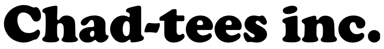
We loved bringing on this new idea of having a certain theme and color to represent us, we felt that it was not the right colors and look for us. While the shapes remained our primary logo, we would also end up updating our wordmark and introducing a new slogan. Ditching the familiar Cooper font, we shifted to a new font that we had been using for a few shirt designs and felt like it better emulated the loose feeling around our cartoonish designs. We also included our slogan, which we thought of on the spot for a newspaper interview for Mercyhurst's Merciad, "Creatvie apparel for the creative mind". We felt that it was a perfect way to introduce our mission as well as our purpose into one singular statement. We make creative apparel, inspired and for those that see the world with the imagination and creativity needed to find happiness and balance. This wordmark and slogan are still used today.

While in the spring of 2022 we had begun looking at all the possible designs to be featured on a hat. We had even ventured into the process of making a new logo to better fit the style of a hat. It was clear that the blue and magenta logo would not be a strong enough option and it was time to move on to something new. With hats being the perfect way to show off a basic logo we evaluated all the potential on-brand designs we had made and we found exactly what we were looking for within the sunflower sticker used the August before.

We had used this logo in our Grateful Dead stickers earlier in the year and it was a perfect way of filling space within a circle in an appealing way. It finally clicked that this would be the logo of the future when we removed it from any excess designs and gave it its own circle. The outside color would be forest green to represent the earthy themes that we love using, as well as our focus on the environment. The logo is simple but compliments our wordmark nicely, keeping the brand together as one.
For our upcoming release we will be tying in this new logo and our slogan together to give you guys a piece that has been long overdue in the Chad-tees inc. collection. There will be many more details and hints of what is to come, so stay tuned!
Thank you for reading parts 1 and 2 of this piece of the blog series!
- Ethan Chadbourne